About Me

Hello Hello... My Name is Kate Bell, I study Visual Art & Design Illustration Level 5.

Tuesday, 17 December 2013

Final Outcomes Macmillan Children's Book


Macmillan Children's Book Mini Exhibition (Red Lion of The Forest)
Well as it always is.... TOTAL MADNESS DEADLINE DAY
But with a lot of hard work and good time management I ended up producing work I am extremely proud of.
3x Double Page spreads
2x Individual A4 pages
Research file, Sketchbook, Sense of Place book, Rough Book & My PDF Portfolio
The overall outcome of my piece I felt was very successful, the us of white space really allowed my work to have more impact. I didn't know what the final outcome would be until it happens on Photoshop, but I'm very happy with my colour contrast and making sure the handcrafted detail was still visible
Fingers crossed for a good mark : )

Monday, 16 December 2013

Chirldren's Book Development


These are some of my final outcome at will be featured in my children's book. The mothers house was a simple us of shape not to much detail as it will over power the over image because their are other images that are more important. The Lions fighting was a challenging aspect of my work because to research the shape of what a lion looks like as well as making sure that it doesn't look like the photograph presented a challenge. But overall I felt the outcome was very successful and will be interesting to see what they look like along side the text and the Angry Lion next to it.


Pages 3 & 4 or the Children's Book
The Hawk giving Hugo the magical feather, as you no I work always producing my illustrations serperatly so even towards the end of the brief I will never no what they look like together until I see if in its location or in a digital format. The hawk was a struggle for me, my drawing skills are good but their were times even I couldn't make that hawks wing into looking like a hand, but with advice and support and the relevent research I need I think the final outcome was very successful the detail on the wing is simple compared with the detail on the Hawk's face which is the focal point on that page, and also adding the feather combined the piece together to tell the story of the text.


These two piece's are from different area's of the book, but they are my favouite elements that I wanted to capture for my final outcomes.
Piece one: After Hugo found out his Princess was gone he went to search for her, I decided for this piece I wanted to look more at angels and points of view, looking down at a map is having the child look though the eye of Hugo as he plans his way to find his princess. The hands are simple shapes, allowing the focal point to be the detail on the map. Over the outcome I felt was very successful and represented my thought process of different layouts and view points. The ANGRY Lion was one of my more simple pieces considering detail on  the face and adding depth of field, showing the lion jumping out from behind a bush add element of surprise and excitement to the story, this piece will also be a double page spread to add more drama along with the text and the 2x Lions fighting.


Friday, 13 December 2013

PDF Portfolio Visit (Guru)

As part of our PDF work we were asked to get in connact with client's, illustrators and designer that have influenced me though out my journey as an illustrator.

Contacting Matt Brays who graduated in 2011 allowed my porfolio to be assess by someone who as experienced portfolio reviews in the passed and also has experience with clients in the Illustration world.
This was his feed back
Hi Kate,
Terribly sorry for the late reply, hope all is going well at uni, and hope your enjoying third year :) 
Anyway, first things first: I love your portfolio! I love the look of your work: you’ve developed a really strong style. A style that is fresh and unique, as well as delicate and sensitive.
You seem to have mastered your working method and made it your own. This is a real achievement- when I, and many other graduates were at this point in the course; we were still struggling to find our style and our voice. To have developed such a strong and confident visual language already is remarkable, and something you should be really proud of!
My favourite pieces are the ‘Wind in the Willows’ characters (The badger is awesome!). Your sophisticated use of colour, texture, shape and composition is of a really professional standard.  
I also really like the way you illustrate people.  Illustrating people isn’t easy: a lot of illustration students and graduates struggle to get a grasp on representing figures; to the extent that many go to great lengths to avoid drawing people at all. That’s why it’s such an achievement to be able to illustrate people so well, and in a way that is uniquely your own!
Anyway, sorry if I’ve rambled on a bit; but I really do love your portfolio! The only advice I can really give is to keep up the good work! 
I hope all that’s been of some help, please don’t hesitate to get in touch if you have any other questions.
Best wishes,
Matt


Overall I am every happy with the comment's by Matthew and intend on showing him more of my work in the furture, the more advice I am given I beleive the better my porfolio will become.

Wednesday, 11 December 2013

PDF Portfolio Visit ( Ashton Sixth Form College)

This was a very special opportunity for me to show other tutors from my passed education my work and how far I have come from my years in education.
Micheal Robinson Foundation Art & Design Teacher at Ashton Sixth Form College was the person who introduced me to mix media art as well as developing my skills. At this point in my life I didn't no what path to take so developing a wide verity of skills that will be important to find my way though the art and design world.
Taking my portfolio to her was a very nervous moment and talking about my work to her was an enjoyable moment as we were talking about old times as well as how my work as progressed.
The feedback from Mrs Robinson was very positive, she said that my work was very clean, and professional, that their is a good sense of style and how I like to work. She said that my logo was very different and maybe to showcase more of my Wind in The Willows textures in the background.
Overall she enjoyed looking at my portfolio and was very pleased with what I have achieved and would like to keep in touch if I need anymore advice.

What I have taken from this experience is not only building relationships with other Tutor and thinker but making sure that I get as much advice as possible, and the understand more about my portfolio and the importance of making sure my work is as good as it can be.

Monday, 9 December 2013

PDF Portfolio


PDF Portfolio
The portfolio process is very important to my development as an illustrator, it also allows me to reflect on how my work has changed? How my style of working has changed? What key area's have been developed more than others?
I PDF process is one that I am not very confident in, the challenges that I faced was making sure what the logo and text are not over powering the image, and also making sure that the layout of my images are clean and that the client can see my style and my way of working very quickly looking though my portfolio.
Overall I think my portfolio demon straight my abilities, my strength in style and the abilities to work with any media and reflect what I would like to do as a career as a children's book illustrator.

Wednesday, 4 December 2013

John Lewis Advert & How it was made


http://www.youtube.com/watch?v=XqWig2WARb0

John Lewis are known for the amazing Christmas advert but this has to be one of my all time favourites, it allowed me to travel back in time to my childhood and the Animation and the quality of the drawings were so moving as well as the music really lifted your spirits and this was a great influence on my development into children's book illustration. Please watch it, it's amazing and so moving.

From this advert they also create a short clip on how they produced this advertisement and who was involved? and the challenges they faced?
Director's Elliot Dear & Yves Geleyn talked about how they would come up with the idea of the advert, and making the subject matter relevant to Christmas and how they would produce this?
They decided  the bear and the hare as best friends, and that the bear never experienced Christmas before, and that was what the Hare go the Bear for Christmas was the opportunity to experience it.....
The sets themselves were a mix between
Drawn Animation
Mix media Sets with great amounts of detail
3D combined with 2D elements
Aaron Blaise the Lead 2D Animator said that you never see hand draw animation anymore, that was what interested me in the project drawing a series of hand crafted figured coming to life from your own hand and not from a keyboard is thrilling. Allowing you to get back to the old hand crafted Disney style drawing that has been lost and forgotten.
John Lewis advert pushed themselves with new challenges, producing something that has never been done or seen before.
Link to the Clip: https://www.youtube.com/watch?v=WKfFhUdXA5M&feature=youtube_gdata_player

Ric Frankland, Founder of Dwelle

Tuesday 3rd December - Lecture Theatre B - 4-5.30pm:
Ric Frankland, Founder of Dwelle

"We created a concept called “sheds for living”, which was later renamed and developed into “dwelle”. This range of micro-buildings transpired when Dwelle investigated an alternative solution to creating small dwellings that could be easily adapted to suit a wide variety of uses and requirements. This was partly due to the high costs and limited options British housing has to offer.

It was paramount that the designs incorporated all of the same criteria that had emerged out of our previous eco-projects. The key difference between the one-off bespoke projects and the “dwelle.ings” is the continual development and improvements made to the design. It’s a building that can be produced on a large scale and will be continually refined. Similar to car or product design.

In 2009, the first prototype was built for the Grand Designs exhibition, which provided the perfect forum for feedback from visitors and exhibitors. Whose responses were invaluable; a number of changes were made to the basic design and specification, resulting in a much improved version.

The buildings are designed and manufactured in Manchester."

Understanding the comparison between the lecture and my work was difficult because their was elements that I though What does this have to do with Illustration?. But the more I was taking notes and listening the Frankland the more I started to understand his though process, its all about design and producing a professional outcome, looking and working with people with a common interest in the world and how they can make homes more affordable as well as ECO friendly to the environment. He has a wide knowledge of how to find clients and to make sure he gets his work out to many clients as possible, by this action he has been involved in many project and been given awards for this designs. What I took from the lecture most of all was how to research events that could help or promote my work and get more clients to see and understand my work, this process is key to me becoming a successful illustrator in the future.

Monday, 2 December 2013

Sketchbook Development


These are some elements from my sketchbook that are the main focus for my story areas of development in photoshop will be used, but only to join the elements together to make a complete piece. Overall the process of my illustrations have been really successful and I will continue to try new experimental materials and create more fun and enjoyable illustrations from the research and inspiration I have collected.


Saturday, 30 November 2013

Hopes, Fears & Opportunities

Aims Started in September:
1. To show my portfolio to at least 2x professional clients, for example Matt my Guru, Carrie May ( Illustrator) passed Tutor's
2. One to One meeting with a Client
3. Develop my knowledge of children book illustration ( Further Reference)
4. Work Hard on my Journal
5. Raise money to go to the London Show ( GREAT OPPORTUNITY)

Reflection on my progress
To reflect on what has happens this first semester is hard because I cannot believe how quick it has gone, and how much I have learnt as an illustrator is such a short space of time. The first an most important progress I believe to have achieved in even more detail is my time management. My work has always been organised that how I like to work and its part of who I am as a person, but it has been a challenge juggling so many different aspects of my project, my Journal, Portfolio and my own practice and making sure they all get an even amount of attention to make sure I portray my work as professionally as possible. So going into my Final Major Project understanding how to manage my time better will allow me to concentrate more on my work and making sure I produce the best work possible. Re flexing on challenges I have faced is also a key point to my development, one of these point is my communicate development, the more opportunities I get to present and talk to students about my work the more confident I believe I have become especially as my final Journal involves a 20min presentation, my ability to be critical, and analysis what I have learnt and how this has impacted on my work is vital in my working practice though out this semester, and also communicating my work to clients as well as I will be emailing my Guru and other illustrators & designer who have influenced me though out this course on my portfolio.
In regards to my work I also wanted to work more into my 8x8 work and my Age Uk and I think I have accomplished that with my first publication of the 8x8 work with my banner, it was a great achievement for me and really allowed me to experience for the first time the feeling of having my work published, This is a similar feeling to my Age Uk, developing the project even more by working on other Historical building is a great achievement for me because it is more a an amazing charity and if my illustrations allow other to communicate their memories, or Stockport's Hat Museum and Chapel's then I am as happy as a undergraduate student can be.
To reflect on my own working practice is very important and my aim was to develop a more critical, and in depth knowledge of children's books and how my work can challenge the traditional children  we see today. To be given an opportunity from Macmillan Children Book Competition I intent on finding new influences and develop a critical understanding or the work especially focusing on the meaning, and incorporating this into my journal.
Aim's for Final Semester:
To become more confident in my abilities as an illustrator
Remembering this is my degree and really push myself and bring together everything I have learn't these past 3 years
Enjoy every minute of working in Stockport, with my friends and Tutor because this is my final year
To develop my Critical Journal and not let my personal demons get in the way ( Proof reading)
To us my connections and build more bridge's with clients and get more feed back from my portfolio
Make sure my portfolio is professional and get as much advice as possible to make sure my work shines
And finally TO GO OUT WITH A BANG, enjoy working, producing and learning and look forward to my future as an illustrator for the rest of my life ( I cannot wait)
Develop thoughts about themes for my Final Major Project:
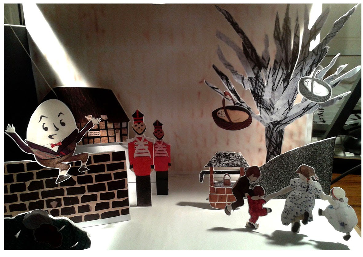
My continuation of my Macmillan children's book is what I had in mind for my FMP, creating the hole 32page children's book, and developing it by adding techniques from my Scary Stories Brief involving set development and design.

BBC1 Judith Kerr The Tiger Who Came To Tea

An illustration from the tiger who came to tea


Judith Kerr and the Story behind The Tiger Who Came To Tea 
By Lucy Wallie
BBC News 

The Tiger Who Came For Tea is one of the most influential books that I have come across not only in this project but also in my own childhood.
This program really surprised me an opened my eyes to the true meaning behind Judith's stories and her childhood growing up in Berlin.
She was born in Berlin, and was forced to flee the country from the Nazi's because she was Jewish and her father Alfred Kerr was a well known political writer. The books Kerr has produced though out her life is based on experiences and also based on her life struggles. What was very emotional was how talented she was at drawing at the age of 9 and how much her mother loved her drawings, and with the heart ache of packing to leave Berlin, her mother packed her drawings because she loved them so much.
Part of the programmed showed Judith remembering life in Germany though her drawing her mother has kept and remembering the people she draw and why? what they were doing? Remembering happy times when she lived their, and not the reality of what was going to happen after she left. In the program she visited her old home in Berlin and said " I don't feel any different from that young girl who used to draw on that balcony" after hearing that I though that was so beautiful and so innocent.
In a lot of her books she tells a story of her family creating warm and safe environment. In the book The Tiger Who Came For Tea, Kerr explained what life was like at home with her 2 children and how she used to tell her daughter the story all the time and said how no one came to visit her, so why not a Tiger come and visit and tea all their food and then leave, with the understanding that the Tiger will never come back, but making the audience want the tiger to come back.
In the program a lot of illustrators and artist were featured in the film, illustrators like Laura Child sharing her influences from the book as well as other artist & designer.
What I will take from this program is new insight to Judith Stories and maybe go back and look though her books and develop that sense of what her life was like? knowing this new information about her and her life struggles and trying to understand what the stories really mean to her.
http://www.bbc.co.uk/news/magazine-25027090

Friday, 22 November 2013

Website Research

Websites are an important factor to our work, in regards to looking at that quality of the work compared with the website. They both need to be as effect as possible to make sure your work is being presented as professionally as possible to clients. One particular website I always enjoy look at as well as keeping updated with her work is....
Carrie May's Website http://www.carriemay.co.uk
The introduction to the Title page to May's website has a very personal connection to her work, showing her technique with typography skill as well as adding small elements of her illustrations interpreted into the introduction, this show me that she has taken a lot of time making sure her first page is a clear reflection of what her work is like??? Very important for a client or an agent who is interested in her work. When you look into the main page of her website she show's a Menu this show her versatility as an illustrator & a Fine Artist. This is very important for my work, in my website I could like to show my skill in different Editorials and children's books, what my work can be used in. This is very important to get clients and to make sure my work is being promoted as best as possible.

Matthew Richardson Website: http://www.matthewxrichardson.com
The introduction was very simple compared to May's introduction, Richardson's introduction goes straight into this main website and the colour combinations are very simple clear white screen, with a large image located on the left. It show a verity of piece of work he has been production and links to his blog and contact details which is very important that it is as clear as possible. His logo should be a little bigger as more focused on his personality in his website, add elements of excitement. But as a website it is very professional layout  but I think his website could be more personal and exciting for clients to see.

Heart Agency Website: http://www.heartagency.com/
The access to the website is very simple and features images that the Agency clients, the simple layout process is very important for clients seeking information about an artist, designer or illustrator this is very important. So making sure the website reflects each clients working under Heart is very difficult but I think they showcase their work very effectively finding artist's information, details, images, and professional people  they have illustrated or designed for in their career.

From this research of website and having a keep updated with the world of Art & Illustration I think its very important that I make my website represent my personality and how playful my work is an can be. Making sure my work is promoted to the best of my ability will allow me more opportunities to promote and advertise my work very clearly and professionally. What I need to work on is making sure my work is available not for just editorial and children's books but for a verity of other process as well, for example. Printing, advertisements, poster design, 3D outcomes and surface design, having these elements show that I have a verity of knowledge and that I am experience in different fields of Illustration & Design.

Tuesday, 19 November 2013

Beatrice Alemagna


 Alemagna is one of my favorite illustrators that I have come across in my studies, the quality of texture, shapes and narrative she brings together is very exciting and very influential part of my studies. The book covers she produces are clever, exciting, inviting to the reader. The tree are my favorite parts of her illustrations, I plan to practice some of her techniques and challenge my own abilities.
The quality of her colour pallet is also very exciting and combines the quality of line, shape and textures. Her work is exciting I plan to look at her work in more depth and continue update myself with her work and progression.

Rough book


Continuing on with my research on my story and developing the language to make it more age appropriate to my audience, it was important to get all my ideas onto paper and start using all this new knowledge about children's books into action. This simple layout design allowed me to looks at the layout of my illustration, making sure that the illustrations move with the text, and also adding illustrations that move across 2 pages to add drama. This process was successful I understood more about cropping, to add more interest, looking at different angels, birds eye, worms eye, Ariel view points. All these elements are worked into parts of my story to add interest and scale I did it also because it a new challenge for me to work not with just a flat space and understand the background and us of space.

The key challenge I have set myself is working with 3 elements, 1 the their, 2 the behind, and 3 the background.
1: Is the illustrations that are most details and have the most importance
2. Is the background with limited details & texture
3. Is simple shapes no pattern or texture's
I decided on this process from my Scary Stories sets, I added to much detail into the background and lost the importance of the story and also characters that were important were not as details.
So working with 3 elements allowed me more time to work on the characters that are important and less on the background because in the end the characters are the story and need to be as good as the story itself.

Where the Wild Things Are


Where the Wild things Are (1963) American Illustrator & Author Maurice Sendak/ Published by Harper & Row
Though out this project and my development of my Journal this book has always been a constant influence in my work, the layout, scale, colour pallets, connections to the audience and typography. All these elements I have aimed to achieve in my own workings of my children's book. Also the layout, what are the illustrations like? Does the type become part of the illustration or on a separate page?. What was interesting to be was how they incorporated the monsters humor's and personality Sendak created each monster with a different personality a lot like the classic Snow White & the Seven Dwarf's each persona had their own personality that create constant excitement and interest in the story. The quality of the illustrations themselves are interesting, looking at the way be creates the fur on the Monsters this how his understand of materials, the colour pallet is simple and more over powering, he keeps the monsters similar colours depending on the personality for example, one is a female with red hair, one has a birds face when the others are similar in shape. Elements like this are key in my research, I hope to look at other children books for inspiration but this book is a key part of my journey to children's book Design. 

Monday, 18 November 2013

Use Of Enchantment Marina Warner

Bettelheim, Bruno, The Use of Enchantment 1976

“You can't teach children to be good. The best you can do for your child is to live a good life yourself. What a parent knows and believes, the child will lean on.” 
― Bruno Bettelheim

This book has been a key influence not only in my Critical Journal but on my practice also, my subject matter has revolved around the historical important of Fairy tales. What they mean? Why they are important to children? How they have changed?
My journey as an illustrator will never end and developing my style of working with children's books is something I an keen to develop my knowledge of, this book has allowed this process to happen. It digusses the emotional, dark & sinister meaning, talking about hoe Authors have abandoned the tradition tales of horror, myth and death. I will continue to us Bettelheim as a key influence to my work, and I cannot wait to learn more about the tales I listen to as a child and what dark meaning they may have?

Fashion Illustration Work Shop


Experiencing Prague in all its wonder was amazing, the buildings, Charles bridge, the exhibitions we went to, but that main reason behind coming to Prague was to sign myself put to do a workshop with a very talented fashion illustrator called Irina Kaygorodova.
After all the walking and following Jo to were her studio was a an experience and such fun, Irina's studio was so beautiful and the perfect place for your create mind to run free. The highlight for the hole session was the example Irina gave us, I could what her paint all day. She was incredibly relaxed even though Irina has about 13 students watching her while she painted ( No pressure). I could really tell that she new how to us watercolour, how it moves, how she can work with it, how much or less water she needed to produce what she was aiming for. 
Watercolour isn't my strongest materials in my visual world and I felt like I wanted to find some scissor or some wallpaper and start cutting, but that just who I am. But I forgot how at peace painting and working with watercolour was, for the first time in a long time I was so relaxed and felt more pressure to get the face or hands I was painting right, it was just the journey that  I was enjoying the most. 
But when it got to the eyes, it was difficult but just watching Irina and how she works with not only the brush but the end of it to create eye lashes was very interesting.
The hole day was amazing and teached me more about how to maybe work with watercolor more in my illustrations especially with text. This is my example of an eye, needs a bit more work but it was a lovely experience and I would like to take this opportunity to thank Irina for the amazing workshop.


Laura Carlin


Laura Carlin is an illustrator that I have looked at a lot for inspiration for my children books especially the Iron Man Children's Book. I also looked her work for the quality for her illustrations, because the shapes and colours she use's are very exaggerated an that it what I need to consecrate on in my illustrations, less making them more real and more playful shapes and colours to interact with the children and adult who will be reading the book.

Saturday, 16 November 2013

Prague 2013


Prague 2013
Prague is the most amazing place in the world, the landscape, the buildings, even the people and the environment was incredible.I would talk forever about my experiences and things I have seen but I don't think we have enough room, traveling to another country is exciting but its even more special when its your last trip as a third year and with your friends you have made in the course. My most favourite part of the trip was going to the MUCHA MUSEUM and the Workshop with Irina Kaygorodova, both experiences were eye opening. 1 learning about MUCHA and the work he produced and the story behind his life and how he created his works, and also learning about Irina work, her experiences in education and working in her studio learning more about the process of watercolour again. 
The group dinner that we had on the last night was interesting, having the chance to meet the new first year as well as getting to no the seconds year also and looking at their work. Well an the night was even more eventful, we danced the night away in Prague.... I will leave it at that....
The Terry Poster Lecture was very interesting, having a chance to look at original posters that are no longer in print, and understanding the process of making posters in that time was interesting, showing us how they were created with college an then printed. 

The hole experience was amazing and I cannot wait to one day go back and show others what I have seen an learn in my time their.

Monday, 11 November 2013

What Does Illustration Mean

Could and should Illustrators do more to push the boundaries of the Discipline.?
On the journey to be a Illustrator the one thing is has tort me to to push boundaries, to understand that anything is possible in illustration. That its not just pretty picture in books, that it means so much more if people took the time to understand how we work and how our minds work they will understand that we create our own images, we have our own imaginations and that we don't just produce work from other peoples ideas. The us of animation, sculpture, and the introduction of technology is something I have worked with in my study years, and have knowledge of how they work, what the end result might be if I choice this materials. The conflict between handcrafted with technology is something that is apparent in illustrators lives. In my work I bring both elements together but the handcrafted style is more apparent than the digital quality, and that how I work, the us of technology is ever changing i books, eBooks and apps have been introduced into our lives, and from personal experience are full of graphics and should have elements of illustration to enrich and bring alive for example a game, an app that changes pictures, these elements don't just have to be boring or be produced by graphic designer because its easier,we shouldn't be labeled as Illustrators that have no imagination.
Illustrators work in all fields not just children books and publishing editorials, a lot of illustrator are influenced by Political & Social matters, when clients are looking for posters or work to be published that they should look at illustrators and not just graphic designers this is what illustrators need to work on to make sure they we are noticed and not forgotten.

I see my work boarding into all areas of design, not only children books, book cover, editorials, 3D sculpture, animation, surface design and even produces design. This is best supported in college because of the equipment we have available, the quality has to be a excellent standard and the experience of the staff will help introduce all these elements and allow you to have that experience to take away with you in the future.

To me I am not too concerned about being called an Illustrator but I understand how people would take offence to being labeled as just an illustrator when they work in other areas other than illustration. Most people ask me what I do an I stay illustration and they don't no what that is so I say Art & Design which is very annoying sometimes, but Art & Design Illustration is what I say to people and by saying this they understand the connection. I think personally this question will never be answered because their will always someone who will agree and disagree.

Thursday, 31 October 2013

8X8 Book Launch

This has to be one of the best feelings in the world, and it has given me to biggest boost in confidence that I no what I'm doing something right in my work and all my work is starting to pay off. Every undergraduate students dream is to get one of their piece of work published well I have along side my fellow students work as well. I was a second year when I produced this work and if you have followed my development of the 8x8 brief this is the final post. 
The Launch of the book was Wednesday 30th October at Manchester School Of Art
I got a chance to talk along side the writer of the amazing story I illustrated by Sian Burns called Never Endings. This is the final outcome. Proudest moment in my life, and I hope I will have more of these moment if I work hard and not give up. An that is what I intend to do.
Thankyou for everyone who was Involved in making the book & My tutor Jo for the opportunity 


Wednesday, 30 October 2013

Children Book Development


What I first started looking at for the brief are children's books.... Some classsical book from my childhood and some more to date childrens books. I did this to look at the audience and age groups that childrens books are aimed at, my age group is around 5 to 7 years old. So looking at classical books like The Guffalo, Roald Dahl and Cat in the Hat allowes me to look at the qaulity of the illusrtations as well as the lanuage of the text... for example? How much text is on one page? is it intergreated with the illustrations or is it seperate? I also wanted to look at the book for influence on layout, size and scale of the illustrations as well as the book's themselves. Most books come in different sizes I think for my book I will keep it to a A4 size as I have elements that I want to strech over 2 pages and I think the A4 size will give me enough space to do that, but I will find and explore more elements as I bring my rough book together.

Monday, 21 October 2013

McMillan Children Book Brief & Story

After a successful start to the year its decision time yet again with 5 different briefs.... Presented with presentations and briefs I decided not to continue my Scary Stories Project and work on a new brief that is very close to the kind of work I want to be producing after Graduation. The McMillan Children work Brief is a great opportunity for me, the only challenge that presented itself was producing a story. Talking to my tutors  I felt the best way to combine my narrative style illustrations with a story is to research classic fairy tale old folk law stories that were at least a 100 years out of copy right ( which means are no longer printed or owned by anyone) and by research into these stories it allows me work with what the text says, this process from working with text is what I find more comfortable and I can change elements of the story if I need to. The outcome will be a front & back page with 2 copyright pages. If the book is successful the extra 32 pages will be an exciting challenge.

Friday, 18 October 2013

Mini exhbition

My first Mini Exhibition for Third Year. How exciting???
This first exhibition I wasn't sure what expect looking at last years exhibitions and the quality they show in the presentation of their work has to be just as good as mine. What really helped me was planning what the exhibition space would look like? measuring the distance and finding the center of the space allowed me to focus on that correct amount of images I need and what other elements I could incorporate into the exhibition. I wanted to my 3D set to be shows in a very professional manner along side my research file and sketchbook what I will do to improve this is maybe to attach the set to the wall and hang my file on the wall. This allows the space to be a lot more clear to the viewer. I incorporated my characters to the space of the visual effect allowing your eyes to move across the 3 photographs, to the set an then down to my characters.
Overall I felt is was a very successful mini exhibition and allows me to gain more experience for when I'm setting up my final degree show.

Wednesday, 16 October 2013

Final 3D Outcome

Producing my final outcome presented a challenge to be at first, trying to work with the scale, lighting and how to create a black background to translate the shadows from the characters.
But as they say I took the bull by the horns and ran with it, it was something that I hadn't worked with before and it gave me another chance to experiment with different piece of technology like working with a camera for the first time.
What I would change about my work would be the quality of the camera I used, I felt it didn't deliver the detail and the strength of colour I was looking for.
I would if I had more time done practice outcomes and maybe allowed myself more time to become comfortable with the equipment I was working with.
I would also change the printing quality and not us the Uni Printers for Final works and go more professional printers for better quality of prints.
But overall I felt my work was taken into a very successful direction and has made big steps already at the start of Third year


Monday, 14 October 2013

Art Director Presentation

Combine my research from the Varoom Article and Glaros Pod caste I think that asking questions about art directors and communicating with them is less of a challenge because you are working together even though they are you clients, This presentation was about what I though an illustrator does? And what questions I should ask an Art Director is they are interested in my work?
Art Director
AD's
Art Editor 
May have experience in Graphic Design, photography or Art themselves

Art Buyers
Have knowledge of Commissioning illustrators & Designers with in AD's Agents

Creative Director
Over sees the creative process looks at the final collection of illustrators and is responsible for the final work in the book.
This presentation has given me great advice on what questions to ask in regards to size or the image? Keeping in contact? Deadlines for drafts? Fees? Printing Deadline? Asking them what they had in mind for the work? Being Flexible but not a push over? This information is key to my success and will be taking this on board and creating table of questions on my wall to remind me or the things I need to ask them in the future.

Wednesday, 9 October 2013

Art Director Stephanie Glaros

Art Director Stephanie Glaros interview (EFII Ep 33)
It is always important to find knew inspiration for my work, but it is also very vital that I listen to the world around me and especially advice from clients that I way be working with in the future. This interview was very interesting for me, Stephanie Glaros, Art Director of Utne Reader Magazine was in felt a very down to earth person with very strong opinions and is very educated in this field as being a Graphic Designer before becoming a Art Director. She talked about how important her relationship is with the illustrator she chooses for a piece of writing and also how she finds the illustrators?? This particular part of the interview I took a key interest to make sure that I get my work out in the world very professionally so that people like Glaros can easily get into contact with me. She also mentioned adding personal touches to my business cards and if I was to send off postcard or posters with my work on to clients, make they very personal and something that the client will remember.  The way Glaros keeps in touch with illustrators is though email or telephone communication and the amount of communication she has with the illustrator depends on the writing, weather or not she wants it do like this.... or if they come up with ideas together... or that she gives the illustrator full rain on the illustration but having them send her draft of the work before the final outcome. To me this communicates a very structured relationship between art director and illustrator developing an understand and trust is a very important part of working together. 


Episode 33 of the Escape From Illustration Island Podcast features an audio interview with Stephanie Glaros, Art Director of Utne Reader Magazine.  Together we discuss Stephanie’s process of learning to be an Art Director the hard way, as well as her search for a seemingly absent Art Director community.  This episode is sponsored by Dripbook.com and TheCreativeFinder.com.


http://illustrationage.com/2010/05/04/efii-podcast-episode-33-art-director-stephanie-glaros/

Monday, 7 October 2013

Age UK Development Opportunity

AGE UK Stockport Brief has allowed me to produce some of my best piece's of work this year, so this opportunity to continue the Age Uk Brief was something I was happy to continue with, and it also allowed me to practice my time management. Working with 2 different briefs at the same time presents a challenge, one that I no I will have to face in the big wide world after I graduate.
Continuing on the Historical Buildings their were spaces that were available for more buildings and different peoples interpretations. I was given the Stockport Chapel Church, what I used in my work was a collection of pencil and my own mark making, I did this to strengthen my Visual World and not using over powering textures, because the church itself is very textured and the black & white side was something I wanted to make more powerful and eye catching, to add more materials would complicate the final outcome.
I used the same background as my Hat Museum piece, to add more unity and all so the contrast between the yellow building and the background I think had more impact.