About Me

Hello Hello... My Name is Kate Bell, I study Visual Art & Design Illustration Level 5.

Tuesday, 17 December 2013

Final Outcomes Macmillan Children's Book


Macmillan Children's Book Mini Exhibition (Red Lion of The Forest)
Well as it always is.... TOTAL MADNESS DEADLINE DAY
But with a lot of hard work and good time management I ended up producing work I am extremely proud of.
3x Double Page spreads
2x Individual A4 pages
Research file, Sketchbook, Sense of Place book, Rough Book & My PDF Portfolio
The overall outcome of my piece I felt was very successful, the us of white space really allowed my work to have more impact. I didn't know what the final outcome would be until it happens on Photoshop, but I'm very happy with my colour contrast and making sure the handcrafted detail was still visible
Fingers crossed for a good mark : )

Monday, 16 December 2013

Chirldren's Book Development


These are some of my final outcome at will be featured in my children's book. The mothers house was a simple us of shape not to much detail as it will over power the over image because their are other images that are more important. The Lions fighting was a challenging aspect of my work because to research the shape of what a lion looks like as well as making sure that it doesn't look like the photograph presented a challenge. But overall I felt the outcome was very successful and will be interesting to see what they look like along side the text and the Angry Lion next to it.


Pages 3 & 4 or the Children's Book
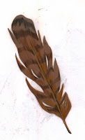
The Hawk giving Hugo the magical feather, as you no I work always producing my illustrations serperatly so even towards the end of the brief I will never no what they look like together until I see if in its location or in a digital format. The hawk was a struggle for me, my drawing skills are good but their were times even I couldn't make that hawks wing into looking like a hand, but with advice and support and the relevent research I need I think the final outcome was very successful the detail on the wing is simple compared with the detail on the Hawk's face which is the focal point on that page, and also adding the feather combined the piece together to tell the story of the text.


These two piece's are from different area's of the book, but they are my favouite elements that I wanted to capture for my final outcomes.
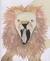
Piece one: After Hugo found out his Princess was gone he went to search for her, I decided for this piece I wanted to look more at angels and points of view, looking down at a map is having the child look though the eye of Hugo as he plans his way to find his princess. The hands are simple shapes, allowing the focal point to be the detail on the map. Over the outcome I felt was very successful and represented my thought process of different layouts and view points. The ANGRY Lion was one of my more simple pieces considering detail on  the face and adding depth of field, showing the lion jumping out from behind a bush add element of surprise and excitement to the story, this piece will also be a double page spread to add more drama along with the text and the 2x Lions fighting.


Friday, 13 December 2013

PDF Portfolio Visit (Guru)

As part of our PDF work we were asked to get in connact with client's, illustrators and designer that have influenced me though out my journey as an illustrator.

Contacting Matt Brays who graduated in 2011 allowed my porfolio to be assess by someone who as experienced portfolio reviews in the passed and also has experience with clients in the Illustration world.
This was his feed back
Hi Kate,
Terribly sorry for the late reply, hope all is going well at uni, and hope your enjoying third year :) 
Anyway, first things first: I love your portfolio! I love the look of your work: you’ve developed a really strong style. A style that is fresh and unique, as well as delicate and sensitive.
You seem to have mastered your working method and made it your own. This is a real achievement- when I, and many other graduates were at this point in the course; we were still struggling to find our style and our voice. To have developed such a strong and confident visual language already is remarkable, and something you should be really proud of!
My favourite pieces are the ‘Wind in the Willows’ characters (The badger is awesome!). Your sophisticated use of colour, texture, shape and composition is of a really professional standard.  
I also really like the way you illustrate people.  Illustrating people isn’t easy: a lot of illustration students and graduates struggle to get a grasp on representing figures; to the extent that many go to great lengths to avoid drawing people at all. That’s why it’s such an achievement to be able to illustrate people so well, and in a way that is uniquely your own!
Anyway, sorry if I’ve rambled on a bit; but I really do love your portfolio! The only advice I can really give is to keep up the good work! 
I hope all that’s been of some help, please don’t hesitate to get in touch if you have any other questions.
Best wishes,
Matt


Overall I am every happy with the comment's by Matthew and intend on showing him more of my work in the furture, the more advice I am given I beleive the better my porfolio will become.

Wednesday, 11 December 2013

PDF Portfolio Visit ( Ashton Sixth Form College)

This was a very special opportunity for me to show other tutors from my passed education my work and how far I have come from my years in education.
Micheal Robinson Foundation Art & Design Teacher at Ashton Sixth Form College was the person who introduced me to mix media art as well as developing my skills. At this point in my life I didn't no what path to take so developing a wide verity of skills that will be important to find my way though the art and design world.
Taking my portfolio to her was a very nervous moment and talking about my work to her was an enjoyable moment as we were talking about old times as well as how my work as progressed.
The feedback from Mrs Robinson was very positive, she said that my work was very clean, and professional, that their is a good sense of style and how I like to work. She said that my logo was very different and maybe to showcase more of my Wind in The Willows textures in the background.
Overall she enjoyed looking at my portfolio and was very pleased with what I have achieved and would like to keep in touch if I need anymore advice.

What I have taken from this experience is not only building relationships with other Tutor and thinker but making sure that I get as much advice as possible, and the understand more about my portfolio and the importance of making sure my work is as good as it can be.

Monday, 9 December 2013

PDF Portfolio


PDF Portfolio
The portfolio process is very important to my development as an illustrator, it also allows me to reflect on how my work has changed? How my style of working has changed? What key area's have been developed more than others?
I PDF process is one that I am not very confident in, the challenges that I faced was making sure what the logo and text are not over powering the image, and also making sure that the layout of my images are clean and that the client can see my style and my way of working very quickly looking though my portfolio.
Overall I think my portfolio demon straight my abilities, my strength in style and the abilities to work with any media and reflect what I would like to do as a career as a children's book illustrator.

Wednesday, 4 December 2013

John Lewis Advert & How it was made


http://www.youtube.com/watch?v=XqWig2WARb0

John Lewis are known for the amazing Christmas advert but this has to be one of my all time favourites, it allowed me to travel back in time to my childhood and the Animation and the quality of the drawings were so moving as well as the music really lifted your spirits and this was a great influence on my development into children's book illustration. Please watch it, it's amazing and so moving.

From this advert they also create a short clip on how they produced this advertisement and who was involved? and the challenges they faced?
Director's Elliot Dear & Yves Geleyn talked about how they would come up with the idea of the advert, and making the subject matter relevant to Christmas and how they would produce this?
They decided  the bear and the hare as best friends, and that the bear never experienced Christmas before, and that was what the Hare go the Bear for Christmas was the opportunity to experience it.....
The sets themselves were a mix between
Drawn Animation
Mix media Sets with great amounts of detail
3D combined with 2D elements
Aaron Blaise the Lead 2D Animator said that you never see hand draw animation anymore, that was what interested me in the project drawing a series of hand crafted figured coming to life from your own hand and not from a keyboard is thrilling. Allowing you to get back to the old hand crafted Disney style drawing that has been lost and forgotten.
John Lewis advert pushed themselves with new challenges, producing something that has never been done or seen before.
Link to the Clip: https://www.youtube.com/watch?v=WKfFhUdXA5M&feature=youtube_gdata_player

Ric Frankland, Founder of Dwelle

Tuesday 3rd December - Lecture Theatre B - 4-5.30pm:
Ric Frankland, Founder of Dwelle

"We created a concept called “sheds for living”, which was later renamed and developed into “dwelle”. This range of micro-buildings transpired when Dwelle investigated an alternative solution to creating small dwellings that could be easily adapted to suit a wide variety of uses and requirements. This was partly due to the high costs and limited options British housing has to offer.

It was paramount that the designs incorporated all of the same criteria that had emerged out of our previous eco-projects. The key difference between the one-off bespoke projects and the “dwelle.ings” is the continual development and improvements made to the design. It’s a building that can be produced on a large scale and will be continually refined. Similar to car or product design.

In 2009, the first prototype was built for the Grand Designs exhibition, which provided the perfect forum for feedback from visitors and exhibitors. Whose responses were invaluable; a number of changes were made to the basic design and specification, resulting in a much improved version.

The buildings are designed and manufactured in Manchester."

Understanding the comparison between the lecture and my work was difficult because their was elements that I though What does this have to do with Illustration?. But the more I was taking notes and listening the Frankland the more I started to understand his though process, its all about design and producing a professional outcome, looking and working with people with a common interest in the world and how they can make homes more affordable as well as ECO friendly to the environment. He has a wide knowledge of how to find clients and to make sure he gets his work out to many clients as possible, by this action he has been involved in many project and been given awards for this designs. What I took from the lecture most of all was how to research events that could help or promote my work and get more clients to see and understand my work, this process is key to me becoming a successful illustrator in the future.

Monday, 2 December 2013

Sketchbook Development


These are some elements from my sketchbook that are the main focus for my story areas of development in photoshop will be used, but only to join the elements together to make a complete piece. Overall the process of my illustrations have been really successful and I will continue to try new experimental materials and create more fun and enjoyable illustrations from the research and inspiration I have collected.